
固定背景bg1を左から右へ動かしたり、じんわり拡大するcssはカスタムに入っている。片方は効かなくしている。
固定背景を非表示にするには、stock-blockをクラス名にいれる。それとbg5 or bg6のクラス名を変更する → bg6stockとか。
スライド、アンカー確認!
【スライドや固定背景の増減についての基本設定・要点】
【基本型4枚 2枚まで増加可能】
通常:
b1 → b2 → b3 → b6 → b7
bg1 → bg2 → bg3 → bg4
1枚追加:
b1 → b2 → b3 → b4 → b6 → b7
bg1 → bg2 → bg3 → bg5 → bg4
2枚追加:
b1 → b2 → b3 → b4 → b5 → b6 → b7 b7は最後のCONTACT用。b6の直後に置く。最後位置の計算に使う。
bg1 → bg2 → bg3 → bg5 → bg6 → bg4 いずれもbg4をラストにする。
b4 / b5:追加用の普通スライド。b3 と b6 の間に入れる。b2・b6と同じ固定幅タイプ。
固定背景を非表示にするには、stock-blockをクラス名にいれる。それとbg5 or bg6のクラス名を変更する → bg6stockとか。
スライド、アンカー確認!
スマホのb1上での配置などを調整する場合
スマホのときのb1上の文字の配置はYOKOHPのcss上で決めている。
/* ======================================
スマホ:b1を透明 + 文字を画面中央表示
+ 位置微調整できる版
====================================== */
body:not(.wp-admin):not(.block-editor-iframe__body){
--b1-text-x: 0px; /* b1全体の文字:左右位置 */
--b1-text-y: -150px; /* b1全体の文字:上下位置 */ ←タイトルのこと
--b1-swipe-x: 0px; /* b1内のsp-only:左右位置 */ ←swipのやつのこと
--b1-swipe-y: 300px; /* b1内のsp-only:上下位置 */
光差し込み+透明からレイヤーor画像へのアニメーション
selector{
position: relative !important;
overflow: hidden !important;
isolation: isolate !important;
}
/* 画像+色レイヤーをまとめて透明から表示 */
selector .wp-block-cover__image-background,
selector .wp-block-cover__background{
animation: coverLayerFadeIn 5.0s ease-out 2.0s both;
animation-play-state: paused;
}
/* このカバー自身がアクティブになったら開始 */
selector.b-anim-active .wp-block-cover__image-background,
selector.b-anim-active .wp-block-cover__background{
animation-play-state: running;
}
/* 光:最初は透明からじんわり表示 */
selector::before{
content: "" !important;
position: absolute !important;
inset: -45% -35% !important;
z-index: 2 !important;
pointer-events: none !important;
background:
linear-gradient(116deg,
transparent 0%,
transparent 16%,
rgba(255,255,255,0.06) 20%,
rgba(255,255,255,0.34) 25%,
rgba(255,255,255,0.12) 31%,
transparent 39%
),
linear-gradient(113deg,
transparent 0%,
transparent 41%,
rgba(255,255,255,0.05) 44%,
rgba(255,255,255,0.24) 45.5%,
rgba(255,255,255,0.05) 47%,
transparent 52%
),
linear-gradient(119deg,
transparent 0%,
transparent 59%,
rgba(255,255,255,0.04) 63%,
rgba(255,255,255,0.26) 68%,
rgba(255,255,255,0.07) 73%,
transparent 81%
),
linear-gradient(111deg,
transparent 0%,
transparent 74%,
rgba(255,255,255,0.04) 75%,
rgba(255,255,255,0.18) 76%,
rgba(255,255,255,0.04) 77%,
transparent 81%
) !important;
filter: blur(10px) !important;
mix-blend-mode: screen !important;
animation: lightMainFadeIn 5.0s ease-out 2.2s both !important;
animation-play-state: paused !important;
}
/* 補助光 */
selector::after{
content: "" !important;
position: absolute !important;
inset: -50% -30% !important;
z-index: 2 !important;
pointer-events: none !important;
background:
linear-gradient(117deg,
transparent 0%,
transparent 32%,
rgba(255,255,255,0.04) 35%,
rgba(255,255,255,0.15) 36.5%,
rgba(255,255,255,0.04) 38%,
transparent 44%
),
linear-gradient(108deg,
transparent 0%,
transparent 52%,
rgba(255,255,255,0.035) 57%,
rgba(255,255,255,0.17) 64%,
rgba(255,255,255,0.05) 70%,
transparent 79%
) !important;
filter: blur(18px) !important;
mix-blend-mode: screen !important;
animation: lightSubFadeIn 5.0s ease-out 2.4s both !important;
animation-play-state: paused !important;
}
/* このカバー自身がアクティブになったら光も開始 */
selector.b-anim-active::before,
selector.b-anim-active::after{
animation-play-state: running !important;
}
/* 文字は一番上 */
selector .wp-block-cover__inner-container{
position: relative !important;
z-index: 3 !important;
}
/* 編集画面では普通に表示 */
.editor-styles-wrapper selector .wp-block-cover__image-background,
.editor-styles-wrapper selector .wp-block-cover__background{
animation: none !important;
}
.editor-styles-wrapper selector::before,
.editor-styles-wrapper selector::after{
animation: none !important;
opacity: 1 !important;
}
/* 透明 → それぞれ元の透明度へ戻る */
@keyframes coverLayerFadeIn{
from{
opacity: 0;
}
}
/* 主光:透明 → 表示 */
@keyframes lightMainFadeIn{
from{
opacity: 0;
}
to{
opacity: 1;
}
}
/* 補助光:透明 → 表示 */
@keyframes lightSubFadeIn{
from{
opacity: 0;
}
to{
opacity: 0.9;
}
}
単にグラデを用いない透明からレイヤーor画像へのアニメーション
/* 画像+色レイヤーをまとめて透明から表示 */
selector .wp-block-cover__image-background,
selector .wp-block-cover__background{
animation: coverLayerFadeIn 5.0s ease-out 2.0s both;
animation-play-state: paused;
}
/* このカバー自身がアクティブになったら開始 */
selector.b-anim-active .wp-block-cover__image-background,
selector.b-anim-active .wp-block-cover__background{
animation-play-state: running;
}
/* 編集画面では普通に表示 */
.editor-styles-wrapper selector .wp-block-cover__image-background,
.editor-styles-wrapper selector .wp-block-cover__background{
animation: none !important;
}
/* 透明 → それぞれ元の透明度へ戻る */
@keyframes coverLayerFadeIn{
from{
opacity: 0;
}
}
グラデ+透明からレイヤーor画像へのアニメーション
selector{
/* ここだけ変更 */
--grad-left: #ffffff00; /* 左の色 */
--grad-right: #e9a02a; /* 右の色 */
--grad-opacity: 0.55; /* グラデの濃さ */
position: relative !important;
overflow: hidden !important;
}
/* カバー色レイヤーをグラデーションにする */
selector .wp-block-cover__background{
background: linear-gradient(
90deg,
var(--grad-left) 0%,
var(--grad-right) 100%
) !important;
opacity: var(--grad-opacity);
}
/* 画像+グラデーションをまとめて透明から表示 */
selector .wp-block-cover__image-background,
selector .wp-block-cover__background{
animation: coverLayerFadeIn 5.0s ease-out 2.0s both;
animation-play-state: paused;
}
/* このカバー自身がアクティブになったら開始 */
selector.b-anim-active .wp-block-cover__image-background,
selector.b-anim-active .wp-block-cover__background{
animation-play-state: running;
}
/* 編集画面では普通に表示 */
.editor-styles-wrapper selector .wp-block-cover__image-background,
.editor-styles-wrapper selector .wp-block-cover__background{
animation: none !important;
}
/* 文字は一番上 */
selector .wp-block-cover__inner-container{
position: relative !important;
z-index: 3 !important;
}
/* 透明 → それぞれ元の透明度へ戻る */
@keyframes coverLayerFadeIn{
from{
opacity: 0;
}
}
お一人でのご利用も、ご友人との2名利用もOK
ONLY PERSONAL GYM
← Swipe Left
REASON
続けられる理由
下のカラムには、横型カード用に左右カラムの高さをそろえるCSSをいれている。左カラムの文章量が多くなっても、右カラムの画像だけ高さが足りずに段差が出るのを防ぐ。
タイトルにスマホ用の仕様を変更するカスタムcssを入れている。スマホは読込型のため、仕様が継承されないため、カスタムcssで設定している。JSもそれが可能な仕様に変更済
01 頑張った姿が、写真で届く
トレーニング中の姿や体の変化を毎回写真で記録し、終了後に共有します。頑張った自分を見返せるから、次も続ける自信につながります。
自分のSNSに載せてもOKです!
02 毎回の目標設定
例えばダイエット目的の方でも体重だけを目標とせず、少しずつ到達できる目標を設定していきます。
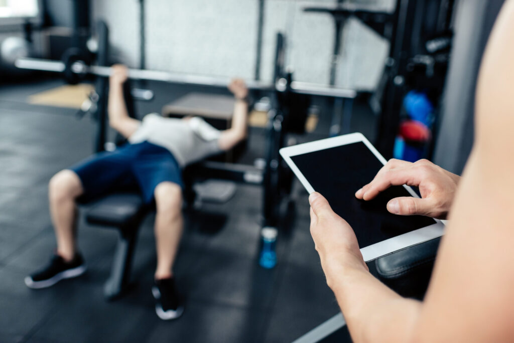
03 食べすぎを整える食事管理
カロリーを極端に減らすのではなく、食事の量・間食・外食の頻度を確認します。何を減らすかより、どこで食べすぎているかを一緒に見つけて整えます。
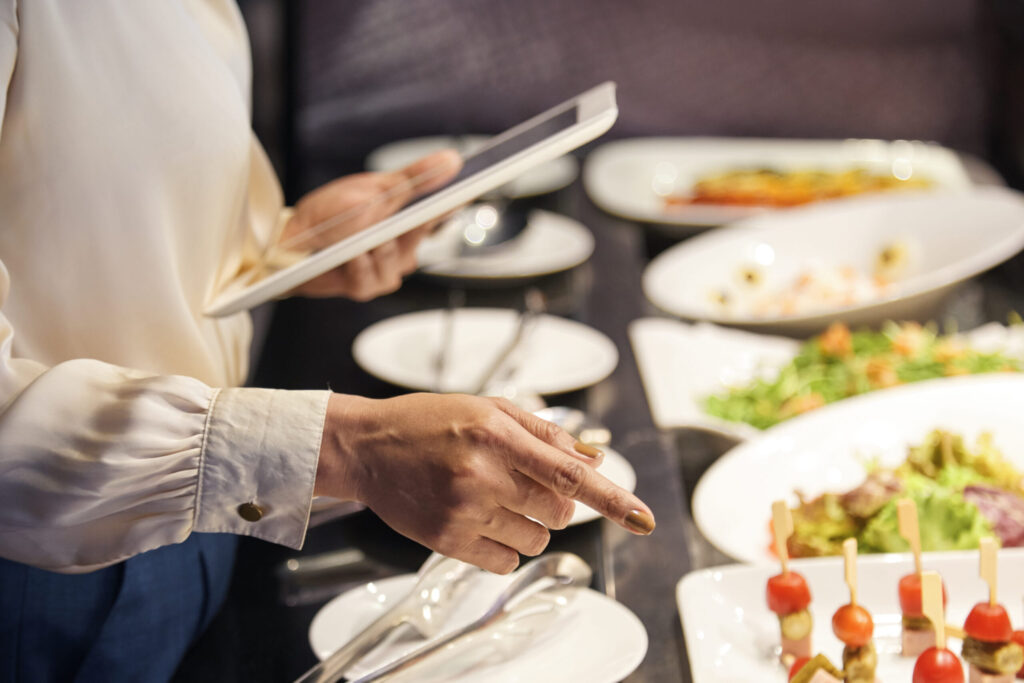
SERVICE
続けられる理由
guidance
MESSAGE
離婚カウンセリングは、法律の答えを出す場所ではありません。
離婚をすすめる場所でも、我慢をすすめる場所でもありません。
DV、モラハラ、浮気、別居、離婚への迷い、夫婦関係の修復など、夫婦の問題にはさまざまな形があります。
「こんなことを話していいのかな」
「どうしていいか分からない」
「気持ちがまとまらない」
そんなふうに、気持ちが揺れたままでもかまいません。うまく話せなくても大丈夫です。
ただあなたの思いを、そのままお聞かせください。
ここはそのための場所です。一つずつ整理していきましょう。
気持ちに整理がつけば、次に何をすべきかが見えやすくなります。
離婚カウンセリングは、法律の答えを出す場所でも、離婚をすすめる場所でも、ましてや我慢をすすめる場所でもありません。
DV、モラハラ、浮気、別居、離婚への迷い、夫婦関係の修復など、夫婦の問題にはさまざまな形があります。
気持ちが揺れたままでもかまいません。うまく話せなくても大丈夫です。
ただあなたの思いを、そのままお聞かせください。
ここはそのための場所です。一つずつ整理していきましょう。
気持ちに整理がつけば、次に何をすべきかが見えやすくなります。
b3の中での各カバーの横幅設定について(重要!)
基本的な設定として、b3のスライドは中身に応じて自動収縮する。ただ、カラムとかを利用する場合、普通の文字を利用する場合と違いが生じる。細かいところは省くが、文字だけならあまり問題ないが、カラムを利用する場合は特に、親のカバーには下記カスタムcssをいれて、幅を指定することを推奨する。ただ、これはあくまでpc-onlyの場合のことでスマホと共通利用の場合はメディアクエリを使用すること。
下記cssの75vwを基本的には上限として内容によって変えていくのが良い。
body:not(.wp-admin):not(.block-editor-iframe__body) selector{
width: 75vw !important;
min-width: 75vw !important;
max-width: none !important;
flex: 0 0 75vw !important;
}
/* 編集画面では幅指定を解除 */
.editor-styles-wrapper selector,
.block-editor-iframe__body selector{
width: auto !important;
min-width: 0 !important;
max-width: none !important;
flex: initial !important;
}
カウンセリングコース
contents
対面相談
当カウンセリングルームにて直接お会いして行います
60分 8,000円(税込)

オンライン相談
ZOOMを利用したオンラインでの対面カウンセリングです
60分 8,000円(税込)

電話相談
ご自宅など安心できる環境での通話OKです
60分 7,000円(税込)
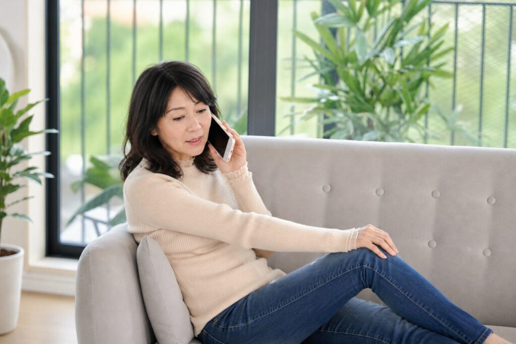
継続相談
継続してカウンセリングを受けることで自分のペースで整理していけます
60分 6,000円(税込)

PRICE
PRICE
カウンセリング
guidance
PRICE 料金・コース
初めての方に
Trial Plan
体験プラン
¥5,000
1回60分
★まずはお試し
気軽にどうぞ
無理なく継続
Light Plan
月4回プラン
¥18,000
1回50分 / 月4回
★継続しやすい人気プラン
習慣化したい人におすすめ
しっかり通う
Standard Plan
月8回プラン
¥33,000
1回50分 / 月8回
★しっかり結果もついてくる
トータルサポート
PRICE 料金・コース
下記料金表のスマホ読込後のフォントや色、構成について
/* ==============================
スマホ料金表:指定画像の形に寄せる
※ JSはそのまま
※ スマホだけ
============================== */
基本的には追加cssでフォントや色や、構成などは構築されている。個別で変えたいところがあれば下記名前のcssのところを変えると良い。ただし、price-enの項目はスマホ読込されるとprice-sp-enにかわるから、調整するときはspの名前を探すとよい。
なお、全体的にフォントを変えたいようなときには下記cssを下のカスタムcssにいれると全体がかわる。
@media screen and (max-width: 768px){
/* 全体のフォント */
.price-sp,
.price-sp *{
font-family: 'Libre Baskerville','Zen Kaku Gothic New', sans-serif !important;
}
}
もし4つなら下記案でやることも可能みたい
b3-free
├─ カバーA
│ ├─ pc-only
│ │ └─ PC料金表 4カード
│ └─ sp-only
│ └─ price-sp-page1
│
└─ カバーB
└─ sp-only
└─ price-sp-page2
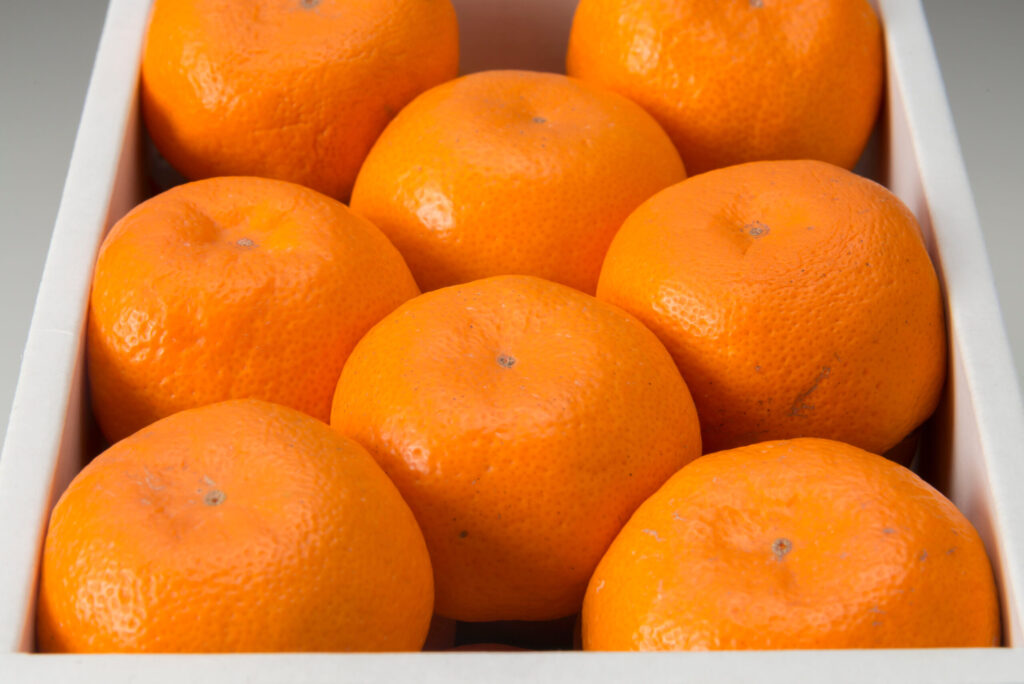
取り扱いみかん
contents
右側の余白スペース維持のためにどこかの文字の後ろに空スペースをいれること。今はワンカラー・・・・込の後ろに全角␣をいれている
温州みかん 3kg/3,000円~
愛媛県産みかんの顔。
甘さと酸味のバランスが良く、贈答用として一番が人気がある品種
せとか 2kg/5,000円~
皮が薄く、果実の形もよく、ジューシーで濃厚な甘さが特徴、「柑橘の女王様」
ちょっと高級な贈答品としておすすめ
伊予柑 2kg/3,000円~
味・色・香りの”よい”3拍子揃い
「愛媛のいよかん、いい予感」のキャッチフレーズで全国的にも有名な品種
ぽんかん 2kg/5,000円~
インド生まれの美しい果実
手で皮がむけ、内袋ごと召し上がれます
甘味の強さと香りが特徴
河内晩柑 2kg/3,500円~
ジューシーでさっぱりとした味が特徴
「和製グレープフルーツ」とも
しっかりとした皮と大粒の果実が特徴
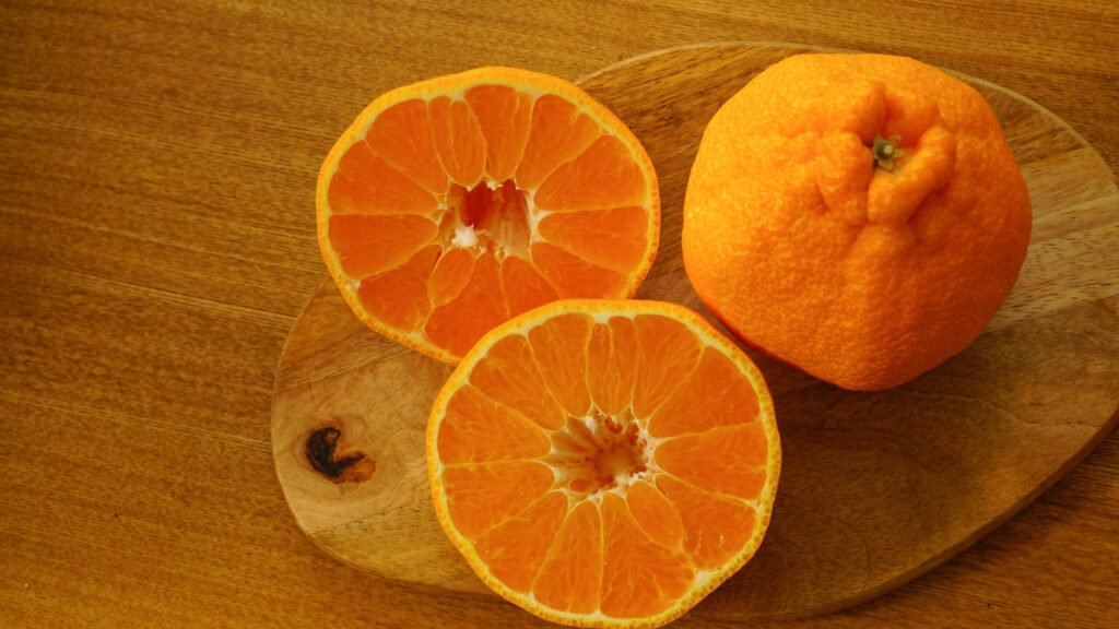
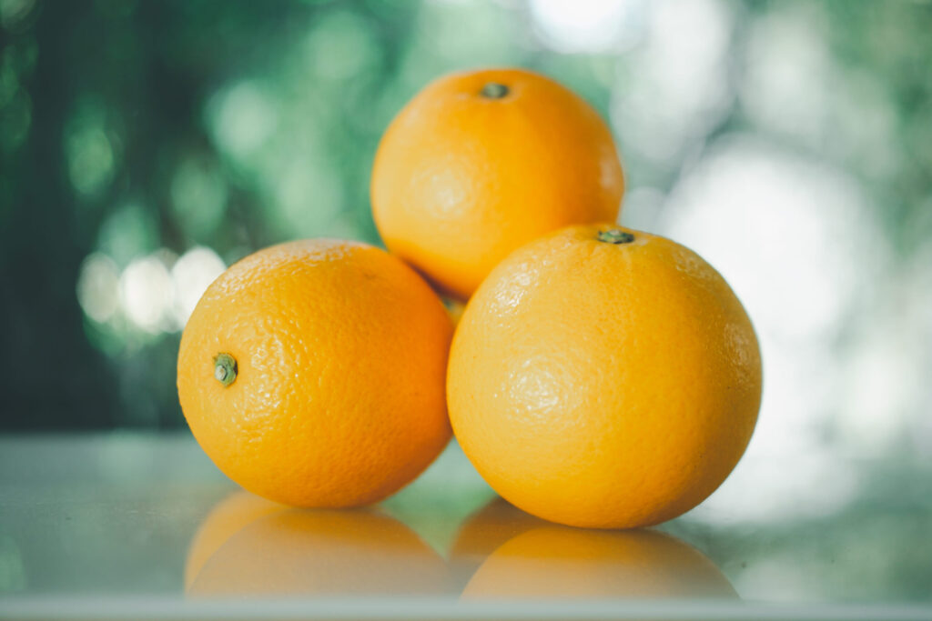
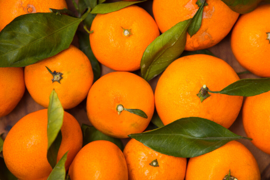
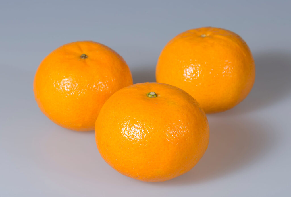
SERVICE
SERVICE-1
取り扱いみかん
guidance
取り扱い商品
contents
右側の余白スペース維持のためにどこかの文字の後ろに空スペースをいれること。今はワンカラー・・・・込の後ろに全角␣をいれている
画像が細長くつぶれてしまうことがある。原因はおそらくb3上の画像についてはそういうことがあるようだ。b3-cover-fitというクラス名をつけると直るようにしている。追加cssにその修正するためのcssは書いている。
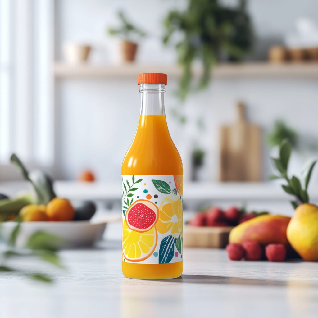
【無添加100%ストレートジュース】
西宇和みかんや伊予柑をはじめ、当農園で栽培している様々な柑橘の果汁を絞ってそのまま瓶詰めしています。
🍊河内晩柑ジュース(720ml)2本セット
販売価格:4,050円(税込)
🍊ぽんかんジュース(720ml)2本セット
販売価格:4,050円(税込)
🍊いよかんジュース(720ml)2本セット
販売価格:4,050円(税込)
🍊みかんジュース(300ml)小瓶6本セット
販売価格4,400円(税込)
季節により準備中の商品もございます
お電話やメールでのご注文も受付しております
SERVICE-2
取り扱い商品
reserve
【無添加100%ストレートジュース】
西宇和みかんや伊予柑をはじめ、当農園で栽培している様々な柑橘の果汁を絞ってそのまま瓶詰めしています。
🍊河内晩柑ジュース(720ml)2本セット
販売価格:4,050円(税込)
🍊ぽんかんジュース(720ml)2本セット
販売価格:4,050円(税込)
🍊いよかんジュース(720ml)2本セット
販売価格:4,050円(税込)
🍊みかんジュース(300ml)小瓶6本セット
販売価格4,400円(税込)
季節により準備中の商品もございます
お電話やメールでのご注文も受付しております
不必要なカバーにはstock-blockをクラス名にいれること。
簡易鑑定
恋愛・仕事・人間関係など、どのようなお悩みでも、時間内であればご質問は何度でも可能です。
10分 50,000円(税込)

鑑定の種類
幸あれ!GOOD!
150分 6,800円(税込)

【スライド枚数を増減させる場合の注意点】
・スライドを増やせば、固定背景、左下のアンかーも同数増やす。左下アンカーは内容より順番が重要。
・追加スライドは b3 と b6 の間に入れる。b4 / b5 は普通スライド専用。
・b7は最後のCONTACT用なので最後に残す。
・bg5 / bg6 は bg4 の後ろではなく、流れとして bg4 の前に入る。
予約の流れ
reserve
1. お電話又はメールフォームでご連絡
2. 初回体験の日程調整
・目的やお悩みを簡単に確認
・持ち物や当日の流れをご案内
3. 初回体験・カウンセリングの実施
・軽いトレーニングを体験
・目標に合わせた通い方をご提案
※体験トレーニングは事前予約制です。
※無理な勧誘は行っておりませんので、まずはお気軽にご相談ください。
・初回体験(事前予約制)では、カウンセリングと簡単なトレーニングをあわせて行います。
・当日は、動きやすい服装・室内用シューズ・タオル・お飲み物をご持参ください。
・ご予約の変更・キャンセルは前日までにご連絡ください。
・体験後に料金プランをご案内しますが、入会を強制するものではありません。
RESERVATION
予約の流れ
reserve
1. LINE又はメールでご連絡
2. 日時のご相談・確定
・日時の調整
・支払い方法のご案内
3. カウンセリングの実施
※オンライン・電話相談は事前決済、対面相談は当日のお支払いとなります。
・ご予約のキャンセルは前日までにご連絡をお願いいたします。
・当日キャンセルは、料金の100%を頂戴いたします。
・ご予約時間に遅れた場合、カウンセリング時間が短くなる場合がございます。
・お支払い後の返金は原則お受けしておりません。
ABOUT
スライドを非表示にするには、stock-blockをクラス名にいれる。それとb4 or b5のクラス名を変更する → b5stockとか。
固定背景、アンカー確認!
TRAINER
代表・トレーナー
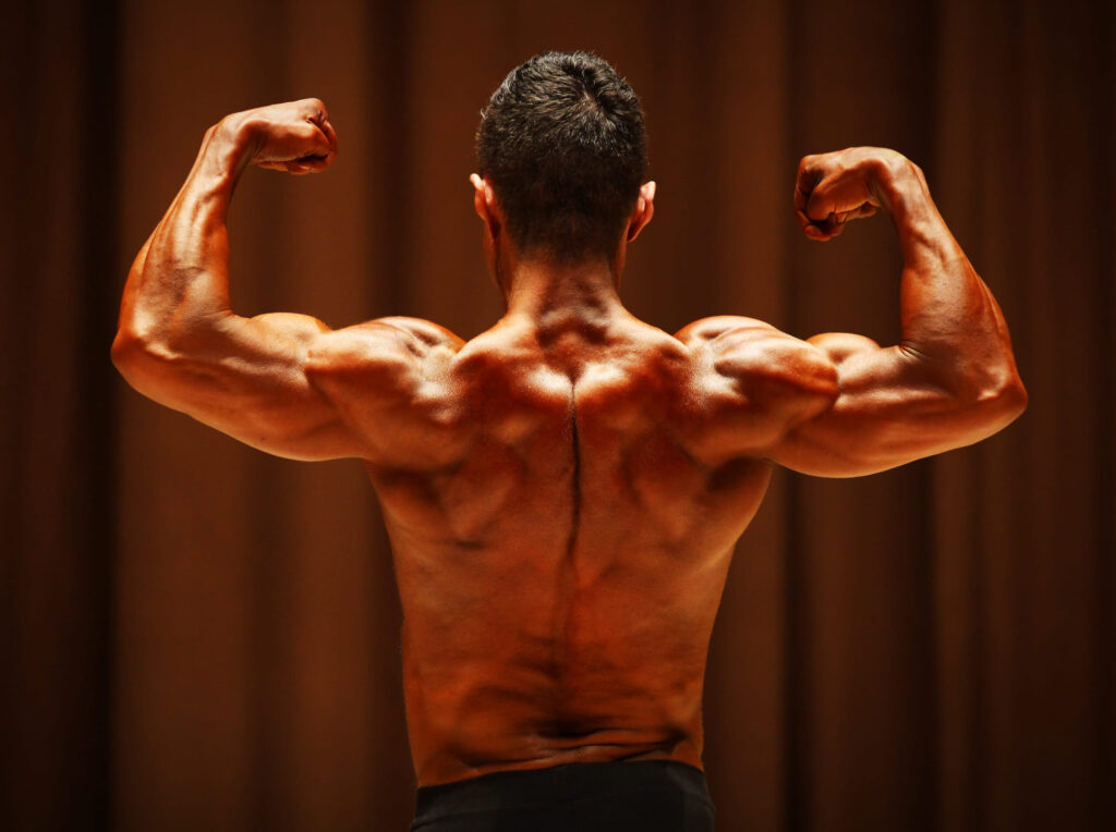
マッスル・R・鷹峰
大手フィットネスクラブで年間1,200本以上のセッションを担当後、独立。
厳しく追い込むだけの指導ではなく、生活習慣・食事・姿勢のクセまで見て、続けられる形に落とし込むのが鷹峰流。
「ただ痩せる」ではなく、服を着たときに分かる体の変化を目指す。
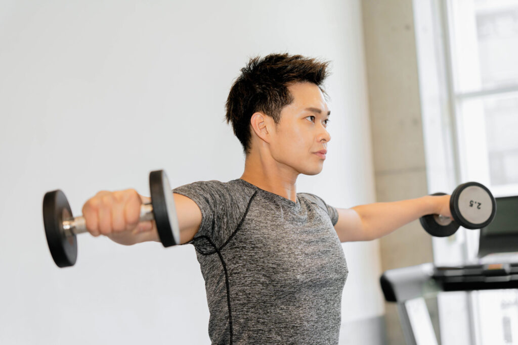
トレーナー
岩城 のぶお
得意なのは、体重だけを落とす指導ではなく、肩幅・背中・腰まわりの見え方を変えるボディメイクダイエット。
猫背や巻き肩で体型が崩れて見える人への姿勢改善メニューもお任せください。
TRAINER トレーナー2名在籍
【slider式プロフィール】スマホ読込後のフォントや色、構成・文章量について(重要) 増減対応可能
上記説明文が高さ枠を超えるとスクロールバー(疑似含む)が出る仕組み。高さの枠は.gym-prof-sp-textのmax-height: 250px !important;で調整する。
/* ==============================
スマホPROFILE:PC項目読み込みスライダー 完成版
PC側:
gym-prof-source
gym-prof-img
gym-prof-role
gym-prof-name
gym-prof-text
SP側:
gym-prof-slider
============================== */
基本的には追加cssでフォントや色や、構成などは構築されている。個別で変えたいところがあれば下記名前のcssのところを変えると良い。ただし、各項目はスマホ読込されるとspという文字が追加されるから、調整するときはsp入りの名前を探すとよい。
なお、全体的にフォントを変えたいようなときには下記cssを下のカスタムcssにいれると全体がかわる。
@media screen and (max-width: 768px){
/* 全体のフォント */
.price-sp,
.price-sp *{
font-family: 'Libre Baskerville','Zen Kaku Gothic New', sans-serif !important;
}
}
PROFILE
夫婦関係カウンセラー
下崎 桜
大学卒業後、結婚相談所で夫婦・家族に関する相談業務に携わる。
その後、心理カウンセリングを学び、夫婦関係や離婚前後の悩みに特化したカウンセラーとして活動を開始。
相談では、結論を急がせることよりも、まずその人自身が何に傷つき、何を守りたいのかを丁寧に見つめることを大切にしています。
趣味は読書と喫茶店めぐり。
休日は静かな場所で本を読んだり、季節の花を見に出かけたりしています。

ABOUT
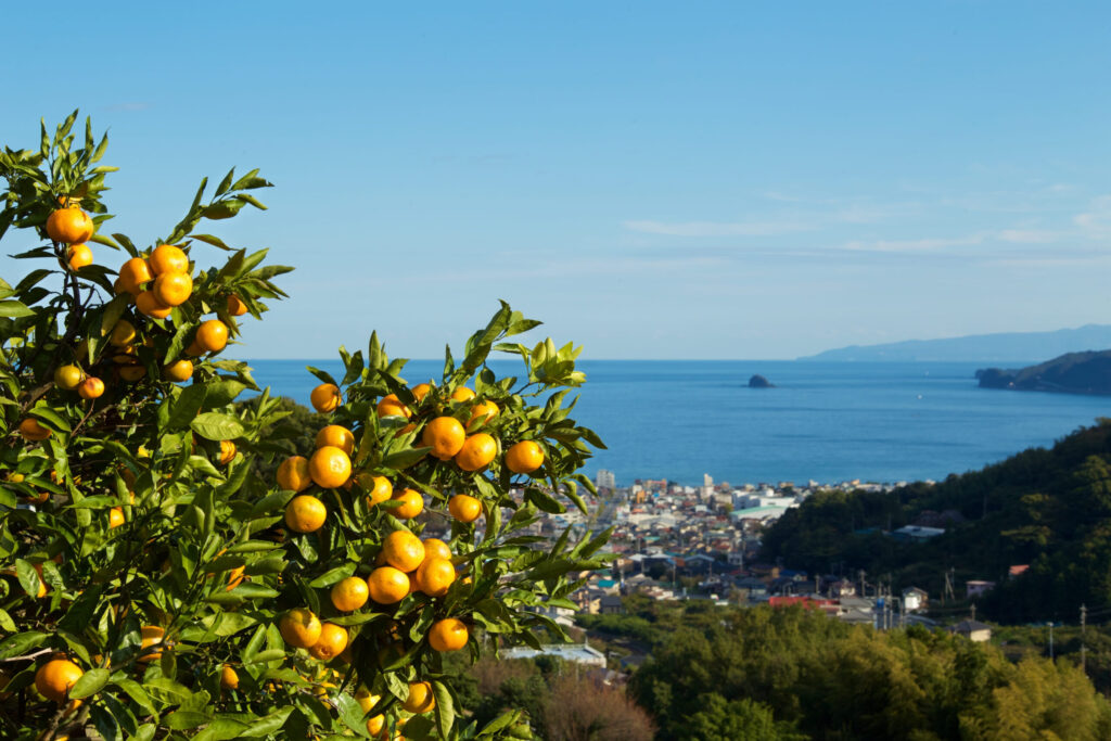
CONTACT
お仕事の依頼・問合わせは
こちらから
ココナラでもお仕事受付中
LINEでの問い合わせもOK

CONTACT
LINE、ココナラでもお仕事受付中
スライドを増やしたら、その場所に対応するリストも同じ位置に増やす必要がある。
b4・b5あり: TOP PROFILE SERVICE 追加ページ名1 追加ページ名2 ABOUT CONTACT
CONTACT以外の通常メニュー → 内容ではなく順番!リスト名は何でもよい。アンカー設定不要
TOP
PROFILE
ABOUT
CONTACT